Pantone Spring 2019 Mood Boards For Modern Interior Design
- Angie Lane
- Mar 16, 2019
- 7 min read
Updated: Nov 7, 2019
When Pantone announces color trends or colors of the year, you will see those colors EVERYWHERE. But when Pantone came out with their spring/summer colors for 2019, I was anything but excited. If I had to make a list of my least favorite colors, many of these would be on it. But I am a firm believer in color and, as an architect, if I can't take a design problem (gross color) and find a solution, than I better find another gig. I was definitely pleasantly surprised by how much I loved the color palettes that came out of these colors.
We all know Pantone are the color experts but I needed to translate the Pantone spring colors 2019 language into a color language for modern interior design. I chose to use paint. And my favorite paint is Benjamin Moore. I chose corresponding Benjamin Moore colors for the Pantone colors and made a Midwest Modern mood board for each palette that could be the spring board for any modern interior design project.
**** The wizard behind the curtain ;) ****
Some of the colors had more of a direct translation than others but I think you'll be happy with the resulting mood boards. The Pantone Princess Blue and Sweet Lilac are very neon-esque and none of the Benjamin Moore colors quite captured their brightness. But that's fine with me.


I chose to do mood boards of each color with an associated color palette so that they could be taken not directly for materials but as a spring board for any modern interior design project, table setting, wedding colors, etc. I tried to keep the color palettes on the spring and summer side but *spoiler alert*, I think they are gorgeous palettes for any time of the year.
Domino did a good article of shoppable items in all the Pantone spring 2019 colors, if you're looking for more specifics. And if you have more questions about these mood boards or how to incorporate any of these colors into your modern home design or into your commercial interiors (office interior design, retail design, restaurant design), I can help with that! Click below and we can talk :)

Pantone Fiesta Turns Into Benjamin Moore Habanero Pepper Mood Board
So this is one of those that, on its own, is not one of my faves. I tend to stay away from reds in general. I have no good reason for this. Red is primary, bold, and hot hot hot!
As much as I don't care for red, I love red with aqua. I don't know why but red and aqua makes me think of spring. I have some imaginary image of a red umbrella with aqua rain drops. I also love red with olive green. To keep it a bit more in line with spring & summer, olive green became chartreuse. Then I threw in everyone's favorite millennial pink and a black to keep it grounded and classic.
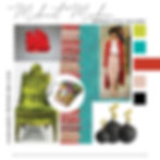
That chair is such perfection- love the finials on it!
Pantone Jester Red Becomes Benjamin Moore Night Flower Mood Board
Depending on the light, this "red" goes to the magenta/purple side rather easily. To give it the spring vibe, I paired it with a punchy, green that's got a hint of blue as well as two icy blues. Some of the warmth comes back with a terra cotta clay pink.

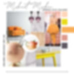
Pantone Turmeric Becomes BM Carlsbad Canyon Mood Board
This deep orange, at first glance, might seem more appropriate for fall but it goes spring / summer like a mofo when it's matched with bright yellows and oranges with a dash of bright sky blue. You can almost feel the sun and taste oranges when you look at this palette.
Pantone Living Coral Becomes BM Bird Of Paradise Mood Board
Living Coral is everywhere since Pantone declared it color of the year. The name says it all. Coral > oceans > beach > summer! And this mood board just screams spring. It's unabashedly pastel but with contemporary lines, shapes, and materials.

Pantone Pink Peacock Becomes Benjamin Moore Hot Lips Mood Board
Again, hot pink is really not my jam. Magenta is really not my jam and this color is the marriage of those two. I toned it down with hot pink's bashful cousin, mauve and a classic navy blue. It gets a punch of color with orange and a wash of spring with the lily of the valley print. If you're not sure about doing pink, I really like this palette because it's pink without being PINK. It's the Jay Gatsby of pink palettes: dignified and elegant with sort of a trashy history. :)

Pantone Pepper Stem Becomes BM Herb Garden Mood Board
We all know spring colors are typically pastels along the lines of an Easter explosion. But spring is also about the greens. I like that Pantone kept them moody and subdued. First up is Pepper Stem which translated nicely into Benjamin Moore's Herb Garden. This isn't the first time I've found myself picking Herb Garden. It's very much a classic army green and I do love me some army green. Herb Garden is so perfect and versatile, it's practically a neutral. It works with almost anything. I chose to do a classic pairing of pink and green. I gave it a pop with icy white and black as well as some springtime flair with a bold, yet timeless rose pattern. And I like the addition of the blood red. It's another great color palette that got pink but is by no means ultra feminine. I also love the cheekiness of the absinthe spoons. The "green dragon" of alcohols was a fitting allusion and absinthe spoons, especially vintage ones, are fantastic on their own right as objects.

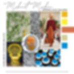
Pantone Aspen Gold Becomes BM Freedom Trail Mood Board
This color translation is probably the one that goes furthest off the rails. Freedom Trail is less gold, and more wheat field. Alone as a color, I don't particularly care for it but with a deep tan, a bright, bone white and the grassiest of greens, I absolutely love it! This palette is so classic and fresh. So much texture and richness with such modest colors.

Pantone Princess Blue Becomes BM Big Country Blue Mood Board
Princess Blue is a really, really electric blue that definitely didn't have a very good Benjamin Moore translation. But if you're looking for bright as hell blue, Benjamin Moore Big Country Blue does not disappoint. The color palette definitely veers a bit from a classic spring motif but the feathers and flowers really bring it to life. And that owl sculpture is so irresistible.

Pantone Toffee Becomes Benjamin Moore Fresh Brew Mood Board
This one is quite possibly my favorite of the series. Sh*t brown is never a great color and as the basis for a spring color palette it seems like a big, fat "nope". But behold! It's spectacular. Who knew that when sh*t brown is together with hot pink, minty greens, and an icy gray it becomes a delight? This room needs to be brought to life if only to showcase that amazing vintage clock. And the butterfly case. How spring is that?? I also love how the quintessential spring garden with butterflies and swans is completed with the linear brown geometric pattern and mint green penny tiles. LOVE THIS!!

Pantone Mango Mojito Becomes BM Golden Archway Mood Board
Ok, this one is pretty classic but the moody, dusky purple and darker pink really give this one an air of sophistication. The moody purple sticks to the background in the purple veined marble and makes a fun appearance in the lighting. This mood board is really playful and fun.
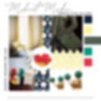
Pantone Terrarium Moss Becomes BM Dakota Shadow Mood Board
This moody green lent itself to a moody spring vibe. The classic, deep, dark navy botanical pattern brings in some spring. The buttery yellow does too. And then there are unexpected bursts of poppy red and and turquoise green. This is one of those palettes that, to me, is a classic. It could easily be the color palette for an entire home. It's got the right balance for modern interior design of classic and elegant with punchy and bright. Not to mention the mix of vintage and new.
Pantone Sweet Lilac Becomes Benjamin Moore Hydrangea Mood Board
Sweet Lilac was a tough one. Upon first glance, it was a hard pass from me. The Pantone color is very bright and did not have a direct translation into Benjamin Moore. Sometimes the Pantone color goes more to the pink side and sometimes it's more lavender. I chose the lavender path and I think it works. Purple, right up there with red, is my least favorite color. But I would love to be in this whimsical space. You probably can't read the model's shirt but it says "It Girl". I found it extremely entertaining when I found the Medusa wedgewood and thinking about her as an "it girl". Actually, I'm not even sure that's Medusa but it sure looks like it to me and I like that idea better than it not being Medusa. So it's Medusa.

As I mentioned before, I think any of these mood boards are the perfect spring board for any modern interior design. Or, free your mind, and these could be the basis for a contemporary home design as well. I also think these colors go well beyond spring. And if a total spring home renovation is daunting, thinking about doing one of these palettes in a powder room or an attic space.
If you're just as in love with any of these palettes as I am and you're wondering how you could being them into your home, let me know. I think you will be pleasantly surprised how easy it is to do and how refreshing it can be.